Hello wizards, I hope you are doing great. Today in this blog you’ll learn how to create the "Temperature Convertor" project using HTML, CSS & JavaScript.
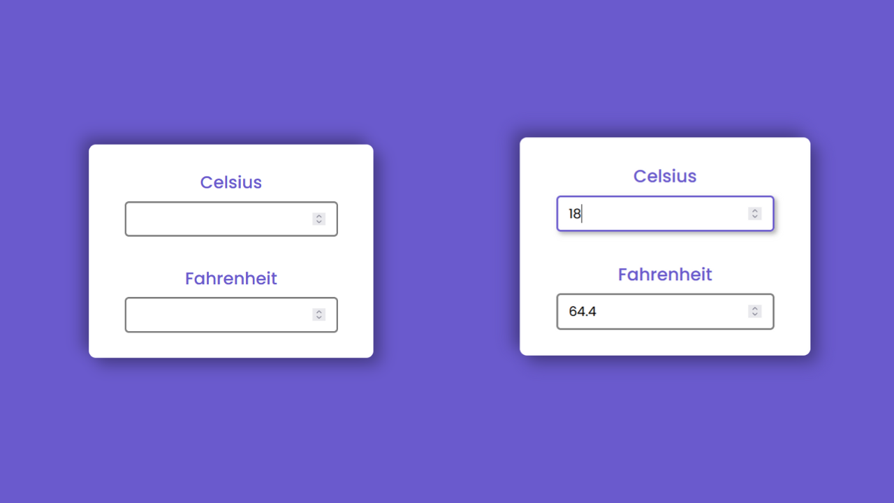
Preview
In the above video, you’ve seen the preview of the "Temperature Convertor" project and I hope now you are able to create this type of project. If not, I have provided all the HTML CSS and JavaScript code below.
Temperature Convertor [Source Code]
To get the following HTML, CSS & JS code for the Temperature Convertor project. You need to create three files one is a HTML file, second one is a CSS file and the another one is JS file. After creating these three files then you can copy-paste the given codes on your document.
Remember, you’ve to create a file with .html extension for HTML code, .css extension for CSS code and .js for JavaScript code.
You can also download all source code files from the given download button.
<!DOCTYPE html>
<html lang="en">

<head>
    <meta charset="UTF-8">
    <meta http-equiv="X-UA-Compatible" content="IE=edge">
    <meta name="viewport" content="width=device-width, initial-scale=1.0">
    <title>Temperature Convertor</title>
    <link rel="stylesheet" href="style.css">
</head>

<body>

    <div class="container">

        <div class="box">
            <h2>Celsius</h2>
            <input type="number" class="celsius">
        </div>

        <div class="box">
            <h2>Fahrenheit</h2>
            <input type="number" class="fahrenheit">
        </div>

    </div>

    <script src="index.js"></script>
</body>

</html>
@import url("https://fonts.googleapis.com/css2?family=Poppins:wght@100;200;300;400;500;600;700;800;900&display=swap");

* {
  margin: 0;
  padding: 0;
  box-sizing: border-box;
  font-family: "Poppins", sans-serif;
}

body {
  background-color: slateblue;
  display: flex;
  align-items: center;
  justify-content: center;
  height: 100vh;
}

.container {
  width: 400px;
  height: 300px;
  background-color: white;
  padding: 50px;
  box-shadow: 10px 10px 20px rgba(0, 0, 0, 0.3),
    -10px -10px 20px rgba(0, 0, 0, 0.3);
  border-radius: 10px;
  display: flex;
  flex-direction: column;
  justify-content: center;
  align-items: center;
  gap: 40px;
}
.box {
  text-align: center;
  width: 100%;
}

h2 {
  font-size: 24px;
  color: slateblue;
  font-weight: 500;
}

input {
  width: 100%;
  height: 50px;
  border-radius: 5px;
  border: 3px solid gray;
  outline: none;
  margin-top: 8px;
  font-size: 18px;
  padding: 0 15px;
}
input:focus {
  border-color: slateblue;
  box-shadow: 3px 3px 6px rgba(0, 0, 0, 0.3);
}
const celsiusEl = document.querySelector(".celsius");
const fahrenheitEl = document.querySelector(".fahrenheit");

celsiusEl.addEventListener("input",()=>{
    const result = ( parseFloat(celsiusEl.value) * 9/5 ) + 32;
    fahrenheitEl.value = parseFloat(result.toFixed(2));
})

fahrenheitEl.addEventListener("input",()=>{
    const result = ( parseFloat(fahrenheitEl.value) - 32) * 5/9;
    celsiusEl.value = parseFloat( result.toFixed(2));
})